Five key merchandising mistakes and how to avoid them
Merchandising is a tool that directly impacts profitability. However, if done incorrectly, it can cost your store money. Mistakes in product display, zoning, or store layout can confuse customers, making them feel uncomfortable or even irritated. This reduces conversion rates and average transaction value.
The most noticeable issue is poor product visibility. If items are placed out of the customer's line of sight or hidden behind other products, they are likely to remain unsold on the shelf. For example, promotional and discount items, which should attract attention, are often placed in “cold” zones. As a result, customers don’t notice them, and the store loses opportunities to increase revenue.
Another common mistake is failing to follow logical product placement. If items frequently bought together are scattered across the store, customers will need to spend extra time searching for them. This frustration increases the likelihood that they’ll leave without making a purchase.
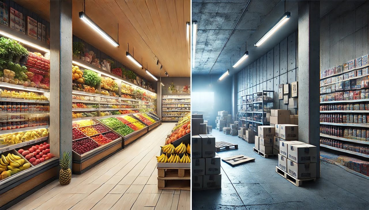
Merchandising mistakes also affect the overall perception of the store. Overcrowded shelves, poor lighting, or confusing navigation create a negative customer experience. Shoppers may conclude that the store is “disorganised,” and by association, that the products are of lower quality. This significantly decreases the chances of a return visit.
The most critical issue is that merchandising mistakes often go unnoticed by business owners. It’s like a hole in your pocket: invisible, but money slips away. To prevent such losses, it’s important to regularly evaluate display effectiveness, consider customer behaviour, and use modern automation tools. By doing so, you’ll not only reduce errors but also create a comfortable and attractive store environment.
Mistake 1. Poor zoning of space

Zoning is the foundation of successful merchandising. It determines which products customers see first, where they spend more time, and which areas go unnoticed. When zoning is poorly executed, the store becomes chaotic, and sales start to decline.
The most common mistake is ignoring "hot" and "cold" zones. Hot zones are high-traffic areas where customers go immediately after entering the store. These areas should feature the most profitable items or new arrivals. However, many stores use these spaces for storing baskets, promotional materials, or leave them empty altogether. This leads to missed sales opportunities.
Cold zones are areas where customers rarely venture or avoid entirely. This can result from inconvenient layouts, poor lighting, or difficult access. If popular products are located in these zones, they go unnoticed. Additionally, long and narrow aisles often become problematic as customers tend to avoid them.
- Use data: analyse customer flow using heat maps. These tools help identify where customers spend the most time and which areas they ignore.
- Plan the customer journey carefully: place essential items near the store's exit so customers must walk through the entire store, increasing the chances of impulse purchases.
- Add visual accents: signs, lighting, and colour elements can guide customers to specific zones.
- Regularly update zoning: adapt zoning to reflect seasonality and demand. This creates a sense of novelty for customers and encourages them to explore the entire store.
How to avoid these mistakes?
Mistake 2. Poor store lighting

Lighting isn’t just about bulbs—it’s a tool that shapes the customer’s mood and influences purchasing decisions. If a store is poorly lit, products lose their appeal, and the shop itself can seem dull or even neglected. Mistakes with lighting are more common than you might think, and each one negatively impacts sales.
The most frequent issue is insufficient lighting in key areas. For example, if shelves with popular products are left in shadow, customers are less likely to notice them. Accent lighting, which should highlight promotional items or new arrivals, is often either missing or poorly distributed. The result? Products blend into the background and fail to stand out.
Another common mistake is lighting that’s either too bright or too cold. Overly intense lighting causes discomfort, especially in areas where customers spend more time. Cold lighting, on the other hand, makes the store feel unwelcoming. For instance, fruits and vegetables under cold lighting appear less fresh, directly reducing their appeal and sales.
- Balance general and accent lighting: general lighting should be even and comfortable for the eyes, while accent lighting should highlight key areas like promotional stands, checkout counters, or popular shelves.
- Use warm tones for food zones: warm lighting enhances the visual appeal of food products, while neutral tones work well for other areas of the store. This makes the shop both inviting and visually attractive.
- Test the lighting in practice: turn on the lights and walk through the store as if you were a customer. Look for “dark spots” where light doesn’t reach and assess how products appear under your lighting.
Regular testing and adjustments to the lighting setup can help prevent mistakes and create an atmosphere that encourages purchases.
How to avoid lighting issues?
Mistake 3. Cluttered or empty shelves

Shelves in a store are the first point of interaction between the customer and the product. Their condition shapes the customer’s perception of the store and its offerings. If shelves are overcrowded or, conversely, empty, it can discourage shoppers and hurt sales.
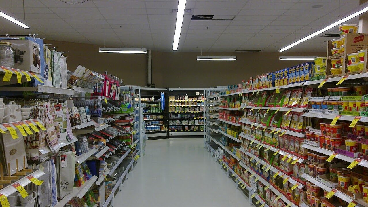
Cluttered shelves are a common issue. When too many products are crammed into one area, customers struggle to focus. They can’t see the structure, feel overwhelmed by the assortment, and may ultimately decide not to buy anything. For instance, a shelf overloaded with promotional items, covered in bright price tags and crowded with dozens of packages, looks more like a storage area than an attractive display.
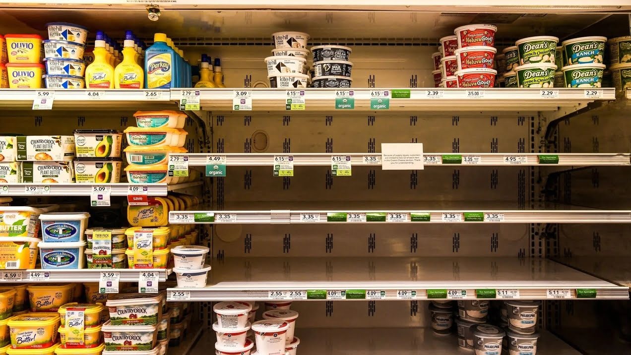
On the other end of the spectrum are empty shelves. They give the impression that the store has supply chain issues or doesn’t care about its assortment. Empty shelves create a sense of neglect and reduce customer trust. Even if a product is temporarily out of stock, leaving the shelves bare is unacceptable—it sends a clear message of poor merchandising management.
- Maintain balance: follow the “golden mean” principle. Products on shelves should be displayed in sufficient quantities while remaining visually organised. For example, neatly arranged rows of products with equal spacing create a sense of order.
- Ensure regular product rotation: if an item is temporarily out of stock, fill the space with similar products or decorative elements to maintain an attractive display.
- Leverage digital tools: software like Greenshelf can help visualise the optimal distribution of products on shelves. These tools create clear display structures and prevent disorganisation.
Most importantly, regularly check the state of the shelves by involving staff in the process. Well-organised shelves with an adequate product supply draw attention and encourage purchases.
How to avoid both extremes?
Mistake 4. Lack of clear navigation and price tags

The inability to navigate the store easily and a lack of transparent pricing information are some of the most common merchandising mistakes. When customers can’t quickly find the products they need or clearly see their prices, it erodes their trust in the store and discourages purchases.
A lack of navigation creates a chaotic shopping experience. Customers get lost, can’t locate the items they’re looking for, and struggle to find promotional offers or new arrivals. This issue is especially problematic in large stores or hypermarkets, where the sheer volume of products and aisles can confuse shoppers. Without clear signage, directional indicators, or floor maps, customers may leave without making a purchase simply because they couldn’t find the items they needed.
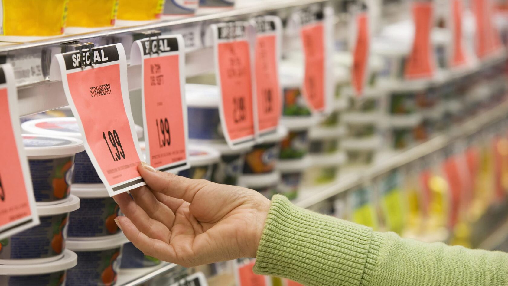
Similarly, missing or poorly displayed price tags can be a major barrier to sales. Even if products are well-organised, customers quickly lose interest if they can’t easily find price information. Issues such as hard-to-read price tags, unclear placement, or missing pricing details create additional obstacles on the path to purchase.
- Create simple and clear navigation: use visible signs and zones with bright and clear labels. Organise products into easily recognisable categories, such as “New Arrivals,” “Discounts,” and “Popular Items.”
- Use standardised and legible price tags: ensure they are clearly visible, placed at eye level, and contain up-to-date information. Promotions or discounts should also be highlighted so customers can immediately see the value.
- Leverage digital solutions: many stores now use digital screens and systems to display current promotions and discounts, enhancing visibility and simplifying the shopping experience.
These steps will help customers navigate your store with ease and make purchases without unnecessary frustration.
How to avoid this mistake?
Mistake 5. Ignoring customer behavior analysis

One of the most critical merchandising mistakes is neglecting to analyze customer behavior. This oversight can result in ineffective product displays that fail to deliver the desired outcomes. Without understanding how customers interact with the store, it’s impossible to optimise the space for maximum sales.
Every customer is unique, and their journey through the store cannot be guessed. For instance, many stores arrange products based on what seems “convenient,” but this doesn’t always align with customer behavior. When a customer enters a store, they typically follow a specific route: from the entrance to the most attractive products, then to essential items, and finally to the checkout. If products aren’t arranged with this route in mind, they may go unnoticed.
Additionally, customers often spend significant time selecting products and may overlook promotions or items that could be helpful to them. Poor product placement in these cases diminishes the shopping experience and lowers conversion rates.
To prevent this, it’s essential to analyze customer behavior. Modern technologies, such as heat maps and video surveillance, can provide valuable insights into how customers move through the store. These data points can then be used to improve store layout and product placement.
For example, if you notice that customers frequently stop in a specific area, consider placing more profitable or promotional items there.
Analyzing customer habits not only makes the store more convenient but also increases the average transaction value. This is particularly important during sales periods, when you can suggest complementary items based on what the customer has already added to their basket.
How to avoid this mistake?
Merchandising mistakes are barriers preventing your store from reaching its full potential. Correcting them is not just a matter of making cosmetic changes—it’s a strategic step toward increasing sales and enhancing the customer experience.
Here are a few practical steps to improve your merchandising:
The key is to implement changes gradually, starting with the most critical issues. Monitor how these changes affect sales and evaluate the results. Identify weak points, create an action plan, and involve your team in the process.
Success lies in attention to detail. Optimising zoning, lighting, shelves, and navigation will not only make your store more convenient for customers but also lead to steady sales growth. Choose tools that help streamline these processes, and your store will become a benchmark for convenience and efficiency.
Here are a few practical steps to improve your merchandising:
- Track "hot" and "cold" zones using heat maps and analyse customer movement patterns throughout the store.
- Make your store bright and inviting by using accent lighting for key products.
- Avoid clutter and emptiness—create clean, organised displays.
- Add clear signage and easily readable price tags.
- Analyse customer behavior and adapt the layout to suit their preferences.
The key is to implement changes gradually, starting with the most critical issues. Monitor how these changes affect sales and evaluate the results. Identify weak points, create an action plan, and involve your team in the process.
Success lies in attention to detail. Optimising zoning, lighting, shelves, and navigation will not only make your store more convenient for customers but also lead to steady sales growth. Choose tools that help streamline these processes, and your store will become a benchmark for convenience and efficiency.
Conclusion
Tilda Publishing