OOS (out-of-stock): concept, causes and analytical tools
Out-Of-Stock Analysis

Individual marketing shortcomings may not be noticeable. However, when the number of such deficiencies exceeds a critical point, a cumulative effect is created, leading to a drop in sales and, in some cases, to the collapse of the business.

One such flaw is under-selling due to Out-Of-Stock.
Causes of Out-Of-Stock
Out-of-stock can occur due to an erroneous calculation of minimum stock levels, and can also be the result of category managers failing to consider factors such as:
- High product turnover;
- Trade marketing campaigns;
- Lack of working capital and/or credit facilities;
- Violation of payment terms and consequent overdue receivables and stoppages of deliveries;
- Lack of manufactured goods or inventory in the supplier's warehouse and, as a consequence, product "hunger";
- Logistics problems and logistics errors;
- Novelty goods;
- Spontaneous surge in customer demand.
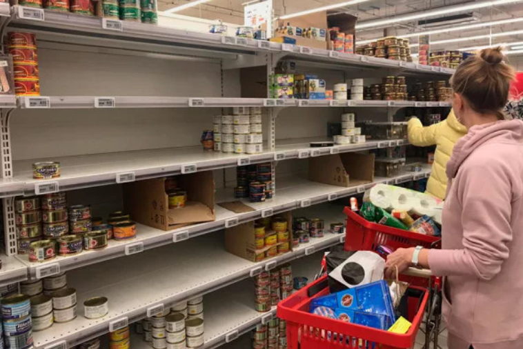
What happens when a customer sees an empty shelf in the place and location where the product they are interested in is usually located?
- For customers, the reputation of the retail outlet falls;
- The customer goes to another shop. If there is a large number of shops in the neighbourhood, some customers will change the place of their regular purchases;
- Instead of the missing product, the buyer can take a similar product of a competing manufacturer and in subsequent purchases will give preference to it;
- The vacated shelf space may be filled with goods of another manufacturer, and the sales representative may find it difficult to regain the space for his goods;
- The sales representative may forget that the empty space, which is then filled with a competitor's products, was once used to position his products and thus lose some sales space;
- The sales representative may develop a reputation for poor skills;
- Everyone suffers a financial loss: the manufacturer, the retail outlet and the sales representative.
Even if there is minimal Out-Of-Stock on a few product lines, over a long period of time, the lost revenue can be quite significant

The first powerful analytical tool is the OOS heat map:
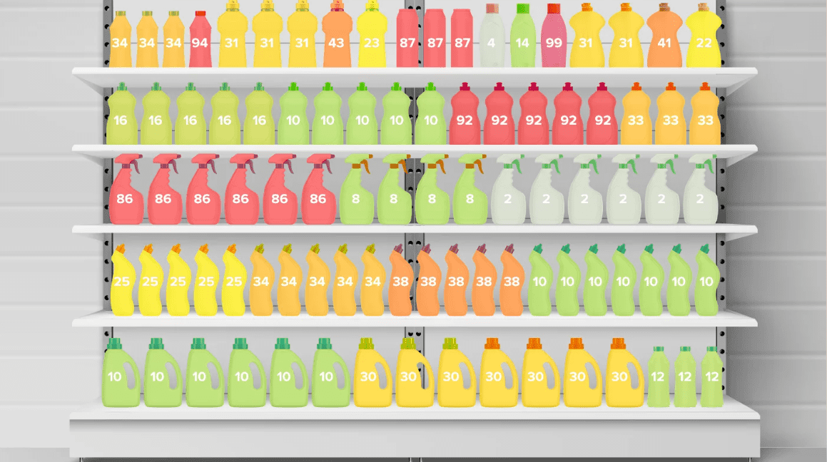
The heat map allows you to visually identify weaknesses in the planogram for one or another indicator. In this case, let's focus on the OOS indicator.
The indicator inside the goods shows the number of days of absence of goods in stock for the selected period.
The heatmap for OOS differs from the heatmap for sales and residuals in the interpretation of colours. The colour of the item encodes the value of the indicator, from the lowest green, to the highest red. The less out-of-stock the item was, the better.
The heatmap can be viewed for any period - week, month, year and even several years.